As an Amazon Associate, VEOJEIN earns from qualifying purchases made through links on this site. This never changes the price you pay.
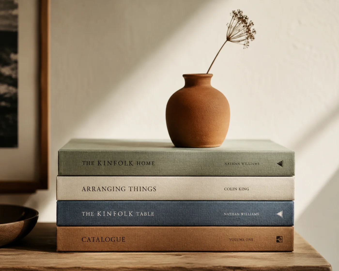
The short version: Decorative books are everywhere on design Instagram, neat stacks in muted spines, a small object placed on top, a candle next to them. But there's a huge gap between decorative books that elevate a shelf and ones that scream 'I bought a bundle from a discount site.
Decorative books are everywhere on design Instagram, neat stacks in muted spines, a small object placed on top, a candle next to them. But there's a huge gap between decorative books that elevate a shelf and ones that scream 'I bought a bundle from a discount site.' The choice between purely aesthetic books and functional dual-use books matters more than people realize, and so do the small sourcing decisions. Here's how to pick books your shelves earn, not borrow.
The two camps: aesthetic-only vs. functional
Aesthetic-only decorative books are sold specifically for display. They're often blank inside (or filled with placeholder text), they have specific muted-color spines designed to match a palette, and they're sized for shelf styling. Cost: typically $25-60 for a 5-book set.
Functional decorative books are real books you'd actually read, picked specifically because their covers and sizes happen to be beautiful. Cost: anywhere from free (your existing collection) to whatever the books happen to cost.
The right answer is almost always *both*. A shelf entirely of aesthetic-only books feels like a movie set, uncanny and inauthentic. A shelf entirely of functional books feels chaotic if you've never curated. The sweet spot: a handful of aesthetic-only books to set the palette, then real, intentional books filling in the rest.
When aesthetic-only books are the right call
Aesthetic-only book sets shine in specific situations:
Open shelving in living rooms where the books are clearly decor, not a working library. The reading happens elsewhere.
Coffee table styling where you want clean color blocks of books to stack with one small object on top, a candle, a vase, a paperweight.
Built-ins with limited shelf height where you need books in a specific size range to fit visually.
Color-coordinated rooms where the palette discipline matters more than the titles. Aesthetic sets let you control the spine color exactly.
Don't use aesthetic-only books in: home libraries where guests would notice they're blank, kids' rooms (real books are better), or single-shelf displays where the book is the whole show (use a real, gorgeous coffee-table book instead).
What makes aesthetic-only books look cheap vs. expensive
Quality signals (look expensive):
- Cloth or linen-bound covers, not glossy paper
- Subtle, low-saturation colors (cream, sage, dusty blue, muted gold, smoky brown)
- No visible 'placeholder' branding or generic logos
- Consistent spine width and proportions across the set
- Embossed or letterpress titles, not flat printed
Warning signs (look cheap):
- Glossy laminated covers reflecting overhead light
- Bright primary colors or jarring contrasts
- Visible 'BOOK' or generic placeholder text on covers
- Wildly inconsistent spine widths (3 thin, 1 enormous)
- Fake leather that creases at first touch
Styling: how to actually arrange them
Two arrangement modes, both work:
Horizontal stacks, books laid flat in stacks of 3-5, topped with a small decor object (candle, sculpture, small plant, paperweight). Stacks should be slightly varied in height. Use 2-3 stacks per shelf, not a continuous wall.
Vertical with horizontal punctuation, most books standing upright, broken up every 4-5 books by a 2-book horizontal stack (creating 'shelves within the shelf'). This is the gold-standard editorial bookshelf look.
Color sequencing matters. Either: (1) tight palette, all books in 2-3 tones in any order; (2) loose gradient, light to dark across the shelf; (3) random with one or two visual 'anchor' books in a contrasting color.
Avoid: rainbow rows (looks dated, like 2014 Pinterest), books packed perfectly flush together with no breathing room, identical spine-width sets in a row (reads as a brochure).
Where to source real, beautiful books on a budget
If you want functional + beautiful books without the aesthetic-only cost:
Used bookstores, for cloth-bound classics, vintage coffee-table books, and out-of-print art books. Prices typically $3-15.
Estate sales, single best source for 'aged' beautiful books with character. Frequently $1-5 a book.
Thrift stores, hit or miss but the rare find at $2 is worth the trip if you're in the area.
Library book sales, quarterly events in most towns; bagful-for-$5 deals are common.
Tip: when shopping in person, take a phone photo of the shelf you're styling and shop *for the palette*. It's the difference between coming home with 30 random books and 6 perfect ones.
Frequently asked questions
Are decorative books from sets actually blank inside?
Often, yes. Some are filled with placeholder text or copyright-free public-domain text (so they look like real books if cracked open). The high-end aesthetic sets are almost always blank, the publisher saves on printing and passes the savings to cover quality.
Can I make my own decorative books from old hardcovers?
Yes, and it's a great budget hack. Buy used hardcovers in the colors you want, peel off the dust jackets, and the cloth-bound covers underneath are usually beautiful. Some people paint or recover with linen for total control.
How many decorative books do I need per shelf?
Most styled shelves use 5-12 books total per shelf, mixed with 1-3 decorative objects. Less can look stark; more starts to look cluttered.
Do designers actually use decorative book sets?
Professional stagers absolutely use them, they're standard in real-estate staging for a clean, neutral look that doesn't reflect any specific household's personality. Interior designers working in real lived-in homes tend to mix aesthetic-only with the client's actual books.
What's the single biggest decorative-book mistake?
Too-uniform sets in too-bright colors. A shelf of 24 identically-sized hot pink decorative books reads as a costume, not a home. Vary spine widths, vary heights slightly, stay in muted tones.